Mobile booking and web page
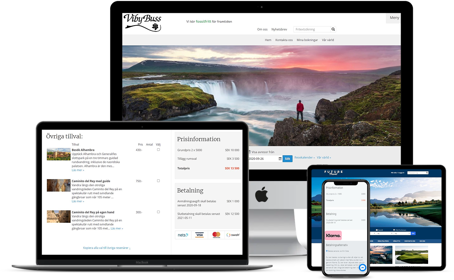
Mobile optimised booking and web page
Mobile browsing is increasing with 250 % per annum. Soon it is expected to be more visitors from mobile units than from desktop computers.
Mobile devices have completely different and new requirements for user friendliness. Responsive design adapting the size and form to the visitor's device, simple pages with large links are some of the key success factors.
To make it simple to welcome users from mobile devices, we have developed a platform for both mobile publishing and booking.
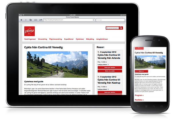


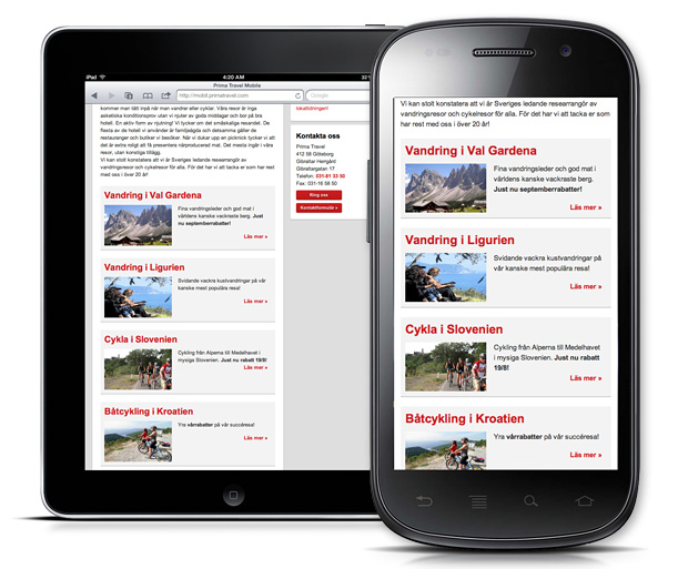
Responsive web design
Responsive web design gives a user friendly page for small mobile screens through surf pads to large desktop screens.
The visitor does not need to zoom or scroll to read and find the content.
Text, pictures, connections to tours etc are the same as for the desktop web - more or less no extra administration is required for the mobile platform.

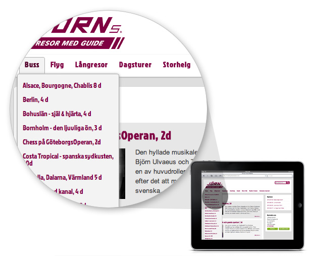
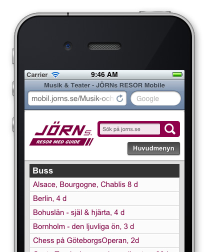
Menu for mobile formats
The menu will adapt and work completely different depending on screen size.
For larger screens such as iPad or Samsung Galaxy Tab it will be a drop-down menu. For smaller screens, the entire main menu will be collapsed and expanded with a click for a mobile menu.

Search as an integrated part of the navigation
Mobiles have less space for menu and links. Search is therefore more important for the navigation. A smart search function is always easy to reach.
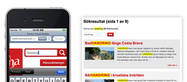

Booking on the mobile device, or let the mobile phone to book
If the client wants to phone and book, this is just one click away. Alternatively, the client books through the responsively designed booking engine. The booking engine can be tailored further for special design and customised booking flow.
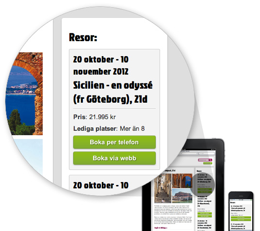

A brand new booking engine
The booking engine is not only responsive and mobile adopted. In addition it has many new features for additions, instant price calculation and similar which have been requested frequently among our 150 + tour operators.
For the past ten years we have constantly added new features to our current booking engine. With this new booking engine we introduce a brand new design and easily adaptable booking engine. Contact us to get a demo, or test it at mobil.primatravel.com.
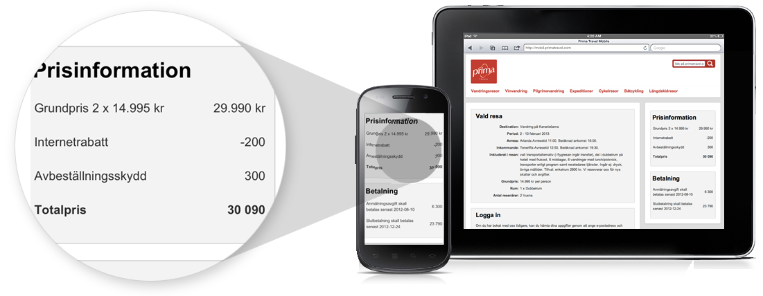

New interface for customer pages
The My Bookings section has also got a brand new design.
Your customers can log in to all bookings and will be welcomed with a nice design.
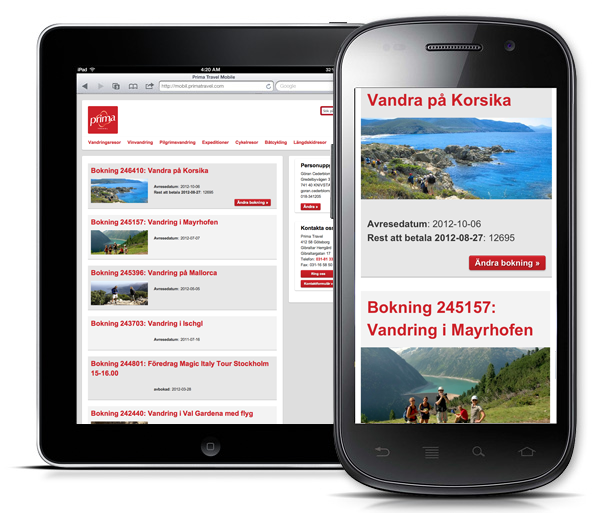

Many standard templates for the mobile web site
Contact
Throughout the page your phone number is clickable and the mobile will phone you. Ipads and similar without a phone, can use Skype. The contact form is responsive.
Brochure order
The brochure order is also responsive.
Other pages
Destination pages, category pages and similar have additional functions to expand and collapse extra text. Wherever tours are connected, they will be shown for easy booking through phone or web.


Gift card module
Web client can buy gift card on the website on any preferred amount. The gift card, with a secure webcode, is sent automatically as soon as it has been paid. Upon booking a tour the customer can enter the webcode and it is checked for validity and automatically used. Gift card can also be used from My Booking.


